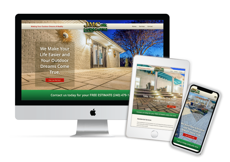
Landscape Website Design
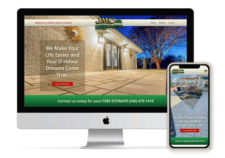
Ingredients
- UX/UI Design
- Copywrite
- Image Editing
- Website Development
Tools
- Figma
Bake Time
- 6 Weeks
Year
- 2023
Meet JMC Landscaping
JMC Landscaping, located in southern Maryland, originally began as a maintenance company, has grown to provide full service landscape from mowing to large scale installation work. With aspirations of owning their local market, JMC Landscaping knew they needed to refresh their online presence, while focusing on expanding their brand to build trust with local clientele.
The Existing Design
The existing website lacked originality and did not adequately represent the brand with the UI design. The layout was tight and did not invite scanning. The font was small and condensed forgoing readability. The design was not mobile friendly and overall the website was not a joy to interact with it.
The Problem
JMC Landscaping’s existing website lacked personality and consistency. The website had no relevant hierarchy, was redundant and lacked a clear flow. Overall, JMC Landscaping’s brand was poorly represented and did not truly invite the user to begin a new conversation.
Branding
Poorly displayed, pixelated branding image used in the page header. Brand colors are flat and are not used in a purposeful manor.
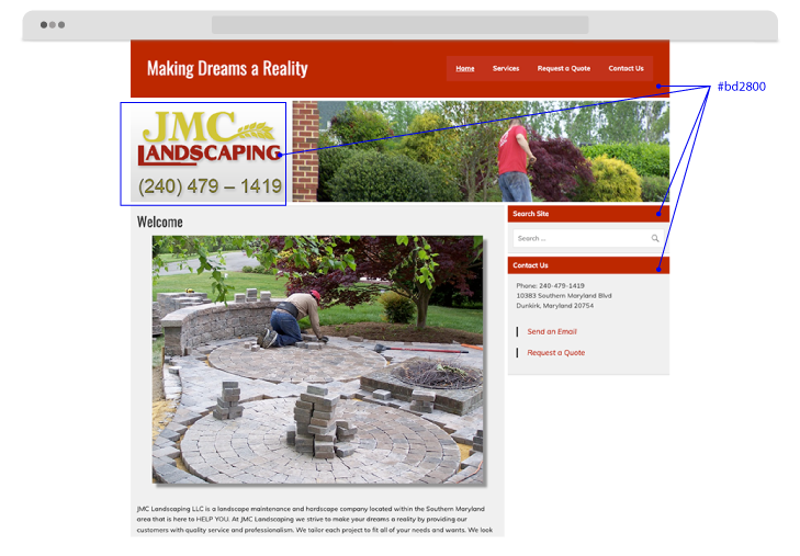
Clutter
Unnecessary features are present with no function.

Layout
The existing layout is condensed and constrictive with minimal hierarchy, restricting scannability.
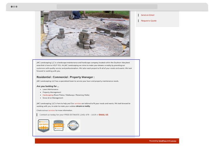
Whitespace
There is an immense amount of whitespace used with no purpose.
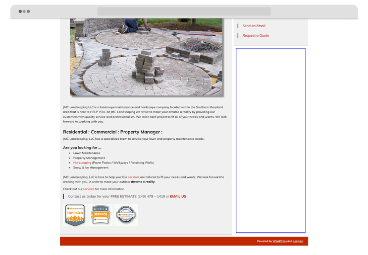
- Poorly displayed branding
- Layout is very condensed and constrictive
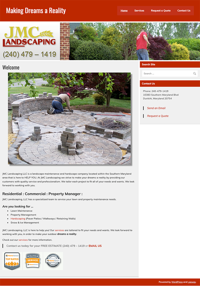
- Brand color scheme is flat
- Unnecessary features and clutter
- Whitespace is immense and used inappropriately
Goal 1
Create opportunity for connection.
Goal 2
Represent the brand as a whole with all services being equal slices.
Goal 3
Ensure an enjoyable experience across all screen sizes.
Logo
JMC Landscaping had an existing logo they love and are proud of, a complete logo redesign would not have made sense in this case. However, to enhance their original design and provide an elevated feel the logo was simplified with rich colors for impact and legibility.

Before

After
Color Scheme
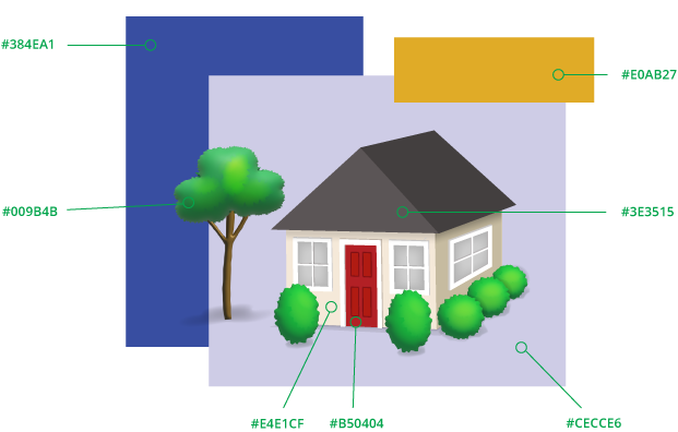
The tetrad color scheme for the design boasts rich, balanced colors that add depth to the design. The colors are used sparingly to provide moments of impact and to draw the eye through the page.
Typography
Open Sans Regular
Aa Bb Cc Dd Ee Ff Gg
Hh Ii Jj Kk Ll Mm Nn
Oo Pp Qq Rr Ss Tt Uu
Vv Ww Xx Yy Zz
0 1 2 3 4 5 6 7 8 9
Open Sans Semibold
Aa Bb Cc Dd Ee Ff Gg
Hh Ii Jj Kk Ll Mm Nn
Oo Pp Qq Rr Ss Tt Uu
Vv Ww Xx Yy Zz
0 1 2 3 4 5 6 7 8 9
Adding Hierarchy, Increasing Scan-ability
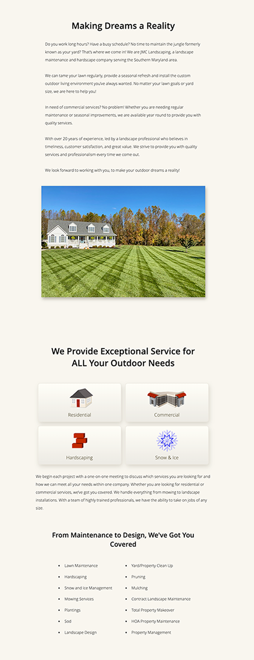
Establishing hierarchy allows users to flow through the page while giving difference elements a sense of importance. Giving scanners a chance to stop at elements that stands out before committing to reading.
Engaging Imagery
Using vibrant images, rich in color, allows the work displayed to be best sprinkles on the page.
Brand Specific Icon Design
Creating a set of icons adds personality, adding a hover effect to match these icons add a sense of whimsey and delight.
Hover:

CTA’s for Engagement
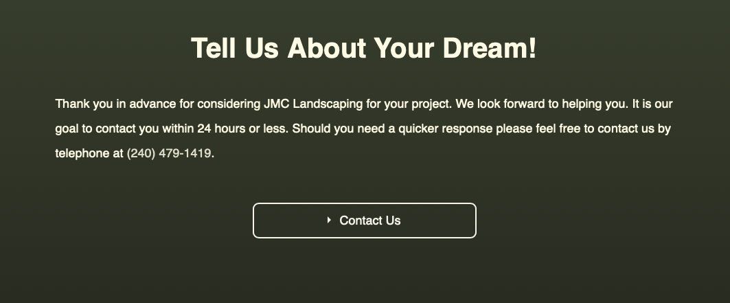
By adding call to actions in incremental locations, the door is being opened for the user to initiate a conversation. The CTA buttons are placed to catch the user when they might be most ready to commit.


Responsive Design
Created a fluid website design to ensure an enjoyable experience across all devices, while maintaining UX/UI standards to provide flow, ease and visual interest for the user.
