DHS Website Redesign
Ingredients
- User Research
- User Insight
- Problem Statement
- Wireframes
- Prototype
Tools
- Figma
Bake Time
- 2 Weeks
Year
- 2022
The Department of Homeland Security
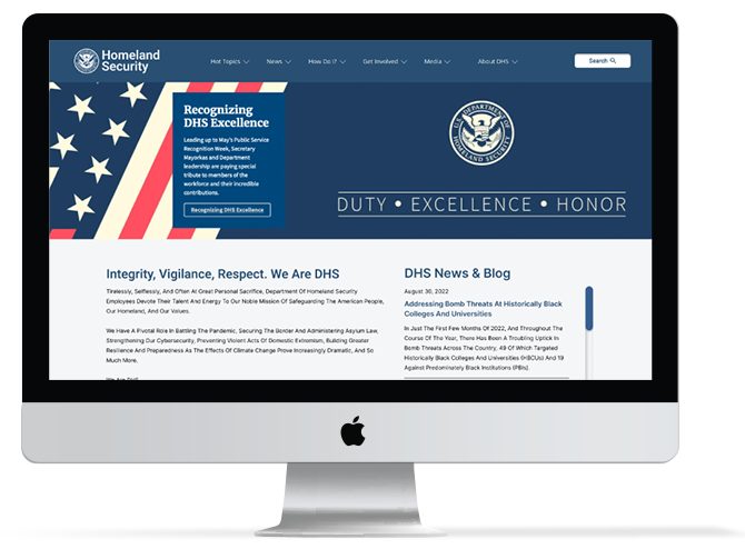
The Department of Homeland Security, DHS, has a clear mission of providing defense to America on all many faceted fronts. They are composed of many mission specific entities, focusing in areas such as border security, citizenship, immigration and natural disasters. Their website is frequented by various types of users including contractors, immigrants and civilians every day.
The Problem
The Department of Homeland Security (DHS) website lacks organization, consistency and an order of importance. The current site does not have a reliable information architecture, and the design is cluttered and overwhelming. Thus, causing the user to gain little to no knowledge when using the site.
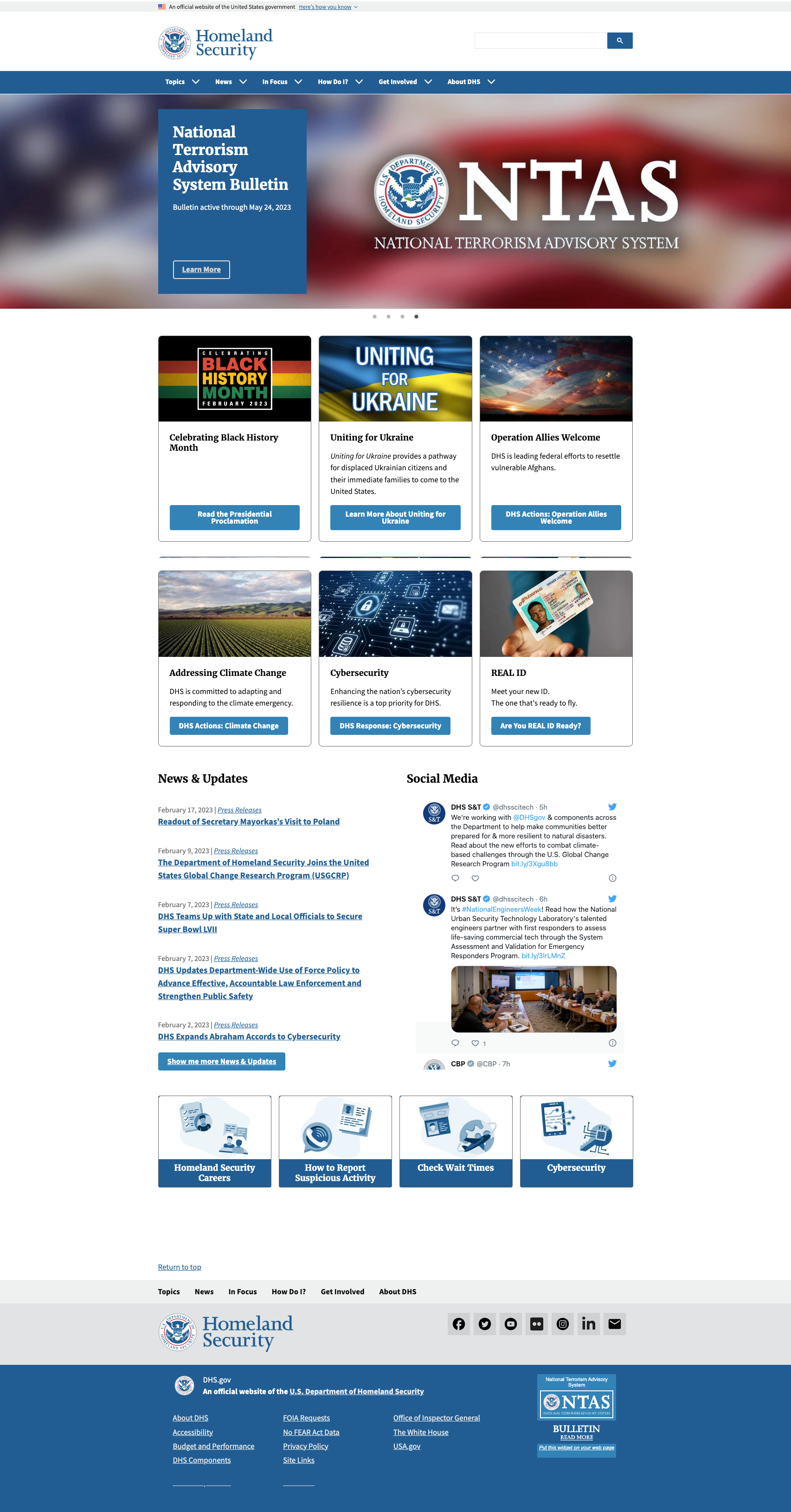 Link to Current Site >
What Did The People Say?
It was important to start the process at the beginning by digging into what people had to say about the website. It was important to see how they moved through the website and what tools
they would use. We asked them to complete a simple task of searching for citizenship resources. We monitored five users and noted their choices, problems and success with the current website.
We discovered the majority of users utilized the search feature to find what they were looking for. When users attempted to use the navigation bar, they found the links were ambiguous and had a hard time tring to replicate their search results.
The Heuristics of it All
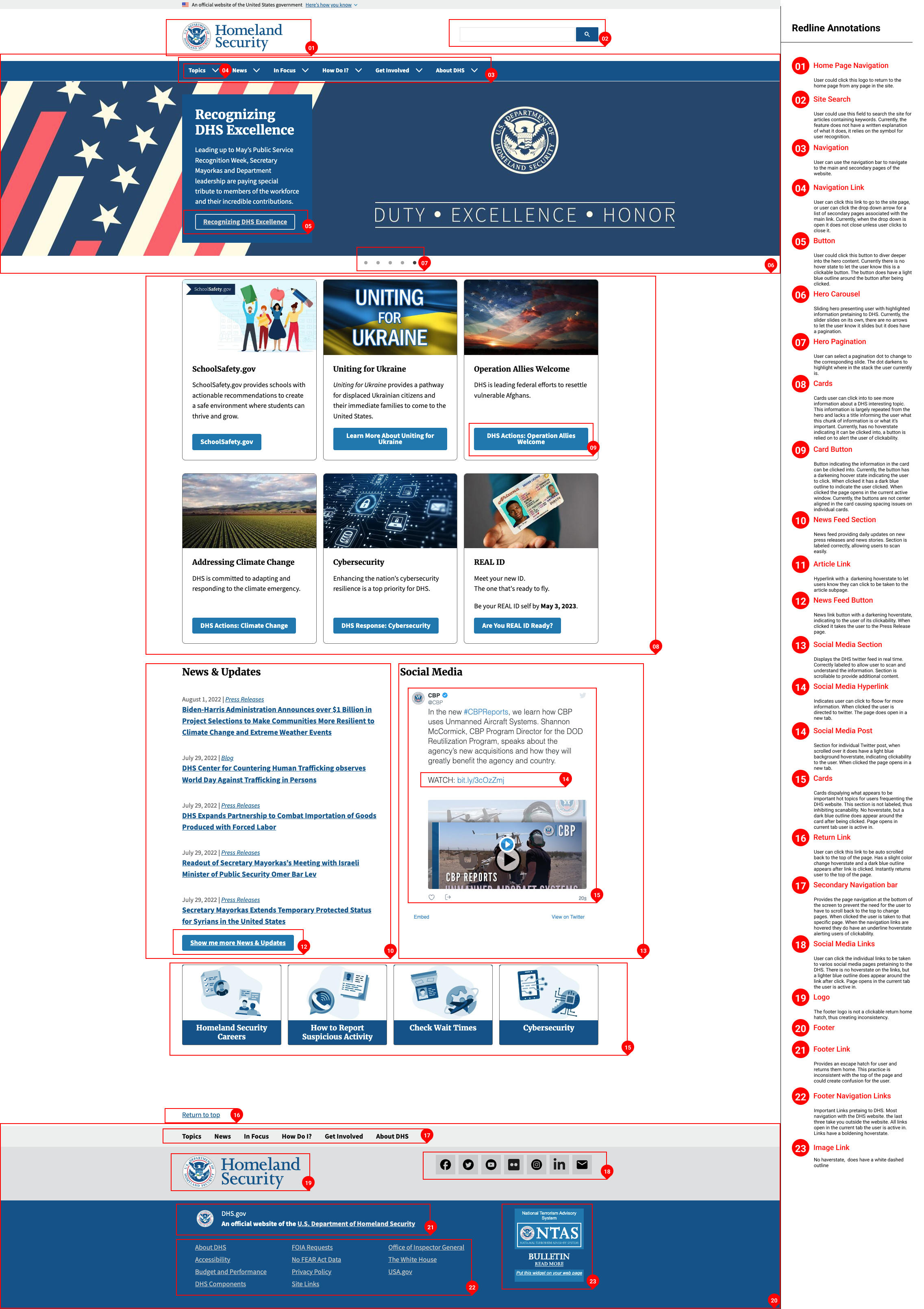
The heuristic evaluation of the current website revealed the design lacks consistency and whitespace, making the site one large block of information the user is forced to digest at once. There is not a clear hierarchy of information thus forgoing scannability. The navigation is disorganized and the sub navigation can cause the user to accidentally deviate to another page.
Iterating For The Solution
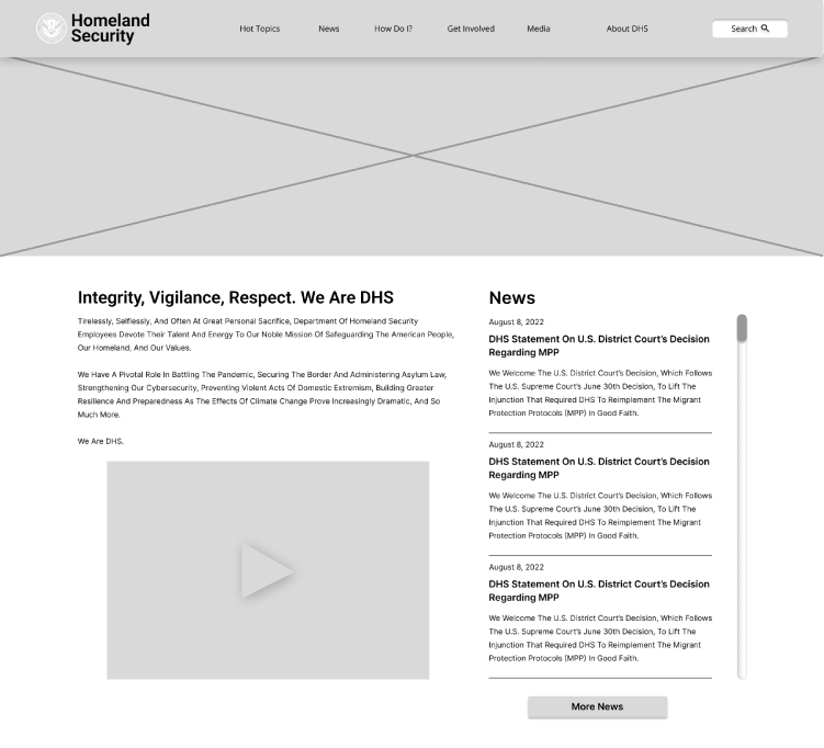
By stripping the exhisting design down and adding an order of relevance and importance, the building blocks for the design emerged leading the way to wireframing.
By introducing white space, the content became more recognizable as individual slices of the cake, making the content more easily digestable. Reordering the content and providing a clear hierarchy system improves scalability and encouragement to travel through the page. Providing order to a chaotic and redundent navigation menu ensures the user won't be lost in the jargon.
Relevance
An introduction to DHS was added to give users a connection with who DHS is. Content intended to keep users informed was relocated to the top.
Hierarchy
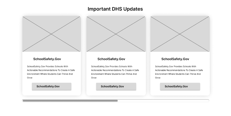
Cards were stylized with a clear hierarchy and placed in a slider to save space.
Trust
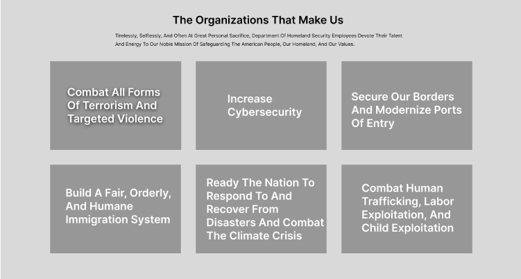
The core mission focues was added to build raport with users and to bring awarness to the issues DHS deals with everyday.
Engagement
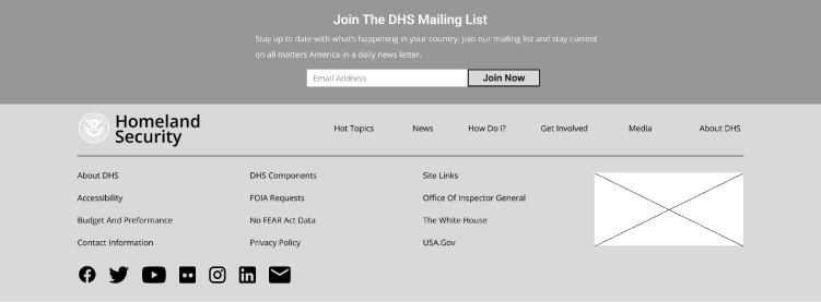
A mailing list option for continued user engagement has been added to keep the user informed on new happenings.
- Hover for High Fi
- Introduction to DHS was added to give users a connection with who DHS is
- Added the core mission focues to build raport with users
- Content intended to keep users informed was relocated to the top
- Cards were stylized with a clear hierarchy and placed in a slider to save space
- An option for continued user engagement has been added
Prototype
A touch of interaction keeps this site simple and professional, yet adds engagement and a sense of pleasure to the user.